Energy charts and time-series export
The hourly energy window with its daily and monthly views, which data source is behind it, and exporting a full-year generation series at your chosen interval.
The Energy view gives you the annual answer and a monthly table. The chart window and the time-series export give you the shape underneath them — hour by hour through a day, month by month through a year, and, when you need it, a full-year generation series in a file. Both come from the energy calculation, so run Calculate Energy first; both are greyed out until you have.
The controls are in the Run Energy Calculation card at the top of the Yield tab: Calculate Energy, 📊 Show Energy Chart, the Interval: selector and Export TMY data CSV, with a status line under them. TMY is a typical meteorological year — a single representative year assembled to stand for the long-run climate at the site, rather than any particular calendar year.
The chart window
📊 Show Energy Chart opens a separate window whose title names the plant it describes — the DC capacity, the mounting type and the performance ratio, in the form "Hourly energy · 48.11 MWp · Fixed tilt · PR 82.9 %". Check the title before reading the chart: if the capacity or the ratio is not the run you think you are looking at, calculate energy again.
One toolbar runs across the top of the window:
| Control | What it does |
|---|---|
| View selector | Daily (hourly) or Monthly (yearly) |
| ◀, the date field, ▶ | Step a day back or forward, or pick a date from the calendar the field opens |
| Chips | Energy for the period shown, the peak hour, and Irradiance |
Daily (hourly)
The window opens on the daily view: one day of the year at a time, in two charts sharing a time axis — 24 hourly bars of energy over 24 bars of in-plane irradiance, the global tilted irradiance striking the plane of the array rather than a horizontal surface.
Under the charts a day slider runs across the year with twelve clickable month ticks, so you can jump to a month and then walk its days. Hover the chart for the hourly values; the readout's own hint says how the window is driven — "Drag along the month strip or use ◀ ▶ · hover the chart for hourly values".
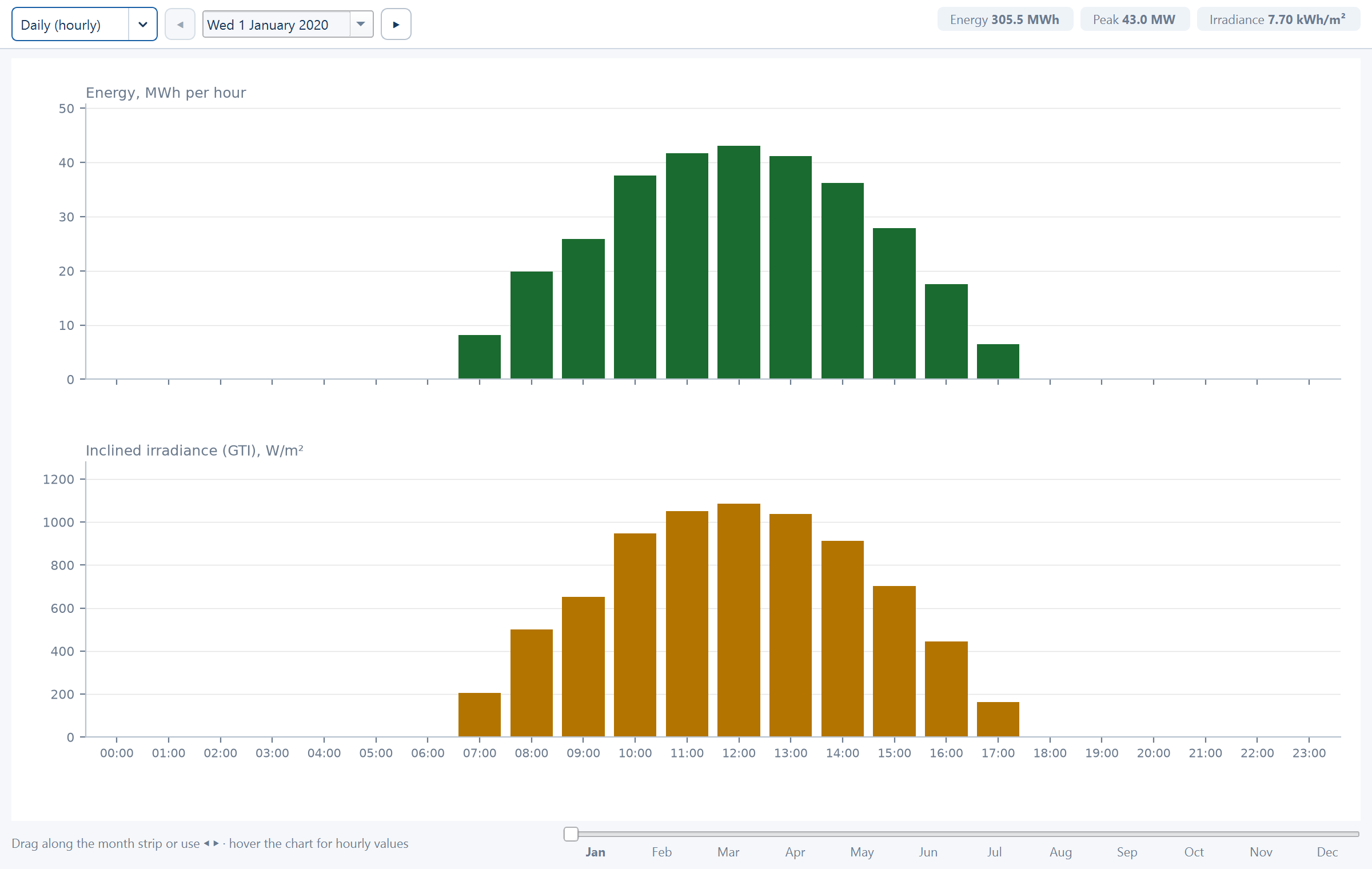
The two charts stacked this way are the point of the view. Energy is in-plane irradiance put through the plant's capacity and its losses, so the pairing gives you both numbers at a chosen hour: so much irradiance arriving, so much energy coming out, on a plant of a known capacity. That is a check anyone can do on the back of an envelope, and it is the fastest way to catch a capacity or a loss assumption that is not what you thought.
One thing not to expect from it: the ratio between the two charts is not the same figure all year. The monthly performance figures follow IEC 61724-1, and the performance ratio inside them varies with module temperature — a hot month converts a given irradiance into less energy than a cool one. Comparing the same hour in January and in June is therefore comparing two slightly different conversion efficiencies, which is the behaviour you want and not an inconsistency.
The day slider is what makes it a design tool rather than a picture. Compare a day near the winter solstice against one near the summer solstice, at the same site: the peak height, the number of generating hours, and the total under the bars all move, and that swing is what the monthly view then aggregates.
Working the daily view
Calculate energy, then open the chart
📊 Show Energy Chart has nothing to draw until Calculate Energy has run. Re-run it after any change to the layout, the losses or the weather source, or the chart is describing the previous design — the window title tells you which.
Click a month tick, then walk the days
A month tick on the strip moves you to that month in one action; ◀ and ▶, or the slider, then step through the days inside it. Working month-first is quicker than dragging across 365 days. The date field's calendar goes straight to a specific date.
Read a pair of values off the hover readout
Put the pointer near the middle of the day. The readout gives the hour's energy and irradiance together, so you never have to line the two axes up by eye. The chips in the toolbar give the energy, the peak hour and the irradiance for the day shown.
Check a midwinter day and a midsummer day
The ratio between them is the seasonal swing your operations and revenue profiles have to live with. Then step across two or three consecutive days: if they are indistinguishable smooth curves, the chart is drawn from a reconstruction rather than from hourly weather — see the priority list below.
Switch to Monthly (yearly) to sum it up
The monthly view is the same data aggregated. Use it to reconcile against the annual figures you are about to report.
Monthly (yearly)
Choose Monthly (yearly) in the view selector for the whole year in one frame: twelve bars of energy, in MWh, and twelve bars of irradiance, in kWh/m², under the caption "Full year 2024 · monthly totals" (the year comes from the weather data).
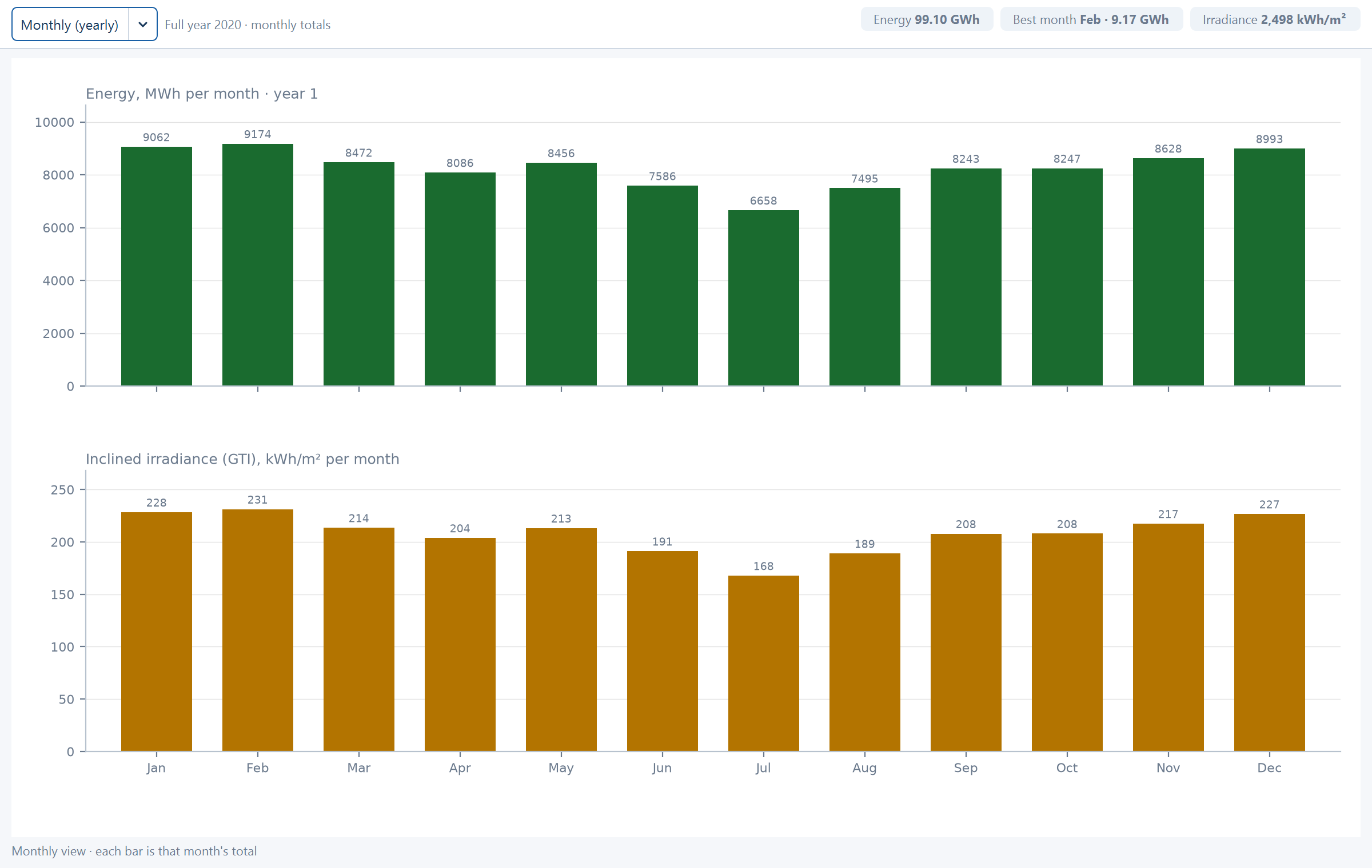
This is the view to cross-check against the Energy view and against the report before either goes out. The irradiance bars are the in-plane irradiation the whole calculation is built on, and the energy bars sum to the year-one generation. A material disagreement with the figures you are about to issue is worth understanding before you issue them — the usual cause is an energy calculation that predates a change to the layout or the losses.
The Energy view's own charts
You do not need the chart window for a monthly picture. The Energy view itself carries two charts under its monthly table — In-plane irradiation (kWh/m², bars) and performance ratio (%, line), and Monthly energy, Year 1 (MWh) — and the same twelve months as a table following IEC 61724-1, the international standard for photovoltaic performance monitoring, which defines reference yield, final yield and performance ratio month by month. See How yield is calculated. The chart window adds what the view cannot show: the hourly shape inside each day.
The monthly table is also written to the report — see Project report.
Where the chart's data comes from
The chart is only as good as the series behind it, and the application will always draw something. It works down a priority list and uses the best source available:
| Priority | Source | What it means for the chart |
|---|---|---|
| 1 | Hourly in-plane irradiance already present in your loaded weather file | Best case. The hourly shape is measured or modelled data for your site, and the chart is showing real variation |
| 2 | Hourly horizontal irradiance from your file, transposed to the plane of the array | Strong. The hour-to-hour variation is real; the split into beam and diffuse and the tilt transposition are modelled |
| 3 | Synthesised from twelve monthly in-plane values plus solar geometry | Weak for any hourly question. The monthly totals are real; the hourly shape inside each month is a smooth reconstruction from sun position, with no weather variation in it |
| 4 | A uniform annual distribution | Placeholder only. It carries no daily or seasonal shape at all |
Know which of these you are looking at before you use a chart to make a decision. A daily profile drawn from priority 3 is a clean, plausible-looking curve that contains no cloud, no haze and no real day-to-day variation — it will never show you the ragged afternoons that matter to a dispatch or a storage study. Its monthly totals are still sound; its hourly detail is a reconstruction.
The way to move up the list is to supply better weather data. An hourly file, or an hourly fetch from the automatic service, puts you at priority 1 or 2 — see Weather data.
Exporting the series
Export TMY data CSV writes the full-year series to a file. The Interval:
selector beside it sets the time step and offers 1 min, 10 min,
15 min, 30 min and 1 hour. It ships at 15 min. The save window
is titled Export TMY Irradiance & Energy Data and proposes
tmy_energy_15min.csv on the default interval.
Pick the interval to match what the series is for, not the finest one on offer. A one-hour file is the smallest and is enough for an annual reconciliation; a 1-minute file is sixty times the size and, as below, contains no more weather detail than the source it was built from.
The per-interval energy relation
E (kWh) = capacity_kWp × GTI(W/m²)/1000 × PR × LID × (interval/60)| Term | What it is |
|---|---|
E | Energy generated in that one interval, in kWh |
capacity_kWp | Installed DC capacity in kWp |
GTI(W/m²) | In-plane irradiance at that instant, in W/m² |
/1000 | Converts W/m² to kW/m², so that the product with capacity in kWp comes out in kW |
PR | Performance ratio — the combined effect of every loss in the breakdown, as a fraction |
LID | The one-off first-year reduction, as a factor: exactly 1 − 1st year degradation ÷ 100, from the same field the annual figures use. On the shipped 1.0 % it is 0.99 |
interval/60 | Converts the interval in minutes into hours, turning power into energy. At 15 min it is 0.25; at 1 hour it is 1 |
The LID factor is worth pinning down, because it decides which year the file
describes. It is the 1st year degradation field and nothing else — the same
one-off step applied to the annual figures, taken as 1 − 1st year degradation ÷ 100. So the exported series is a first-year series, consistent with the
year-one energy on the Energy view, and the annual degradation rate does not
enter it at all: there is no exported series for year 10. See
Lifetime, degradation and P-values.
The relation is linear in irradiance, so the exported series has the same shape as the irradiance series it was built from. Two consequences the file records directly:
- Timestamps are local time. Values are therefore zero through the night and peak around solar noon. A series that peaks at midnight has been read with the wrong time base somewhere downstream, not exported wrongly.
- A sub-hourly interval does not create sub-hourly weather. Choosing 1 min gives you 1-minute rows, but the underlying irradiance resolution is whatever your weather source provided. Finer intervals give a finer grid, not more information.
The export needs an hourly series
The export requires an hourly series to work from — either an hourly weather file you loaded, or an hourly fetch from the automatic service. Monthly data alone is not enough, and the export is not available from it.
This is the one place where the choice of weather source is not a question of quality but of capability. If you need a generation series, arrange for hourly data before you plan the work around the export.
What the file contains, and what it is for
The file carries the full-year series at your chosen interval:
- Horizontal irradiance (GHI) — what arrives on a horizontal surface.
- In-plane irradiance (GTI) — what arrives on the plane of the array.
- Energy — the generation computed by the relation above.
Having all three in one file is what makes it checkable by someone else: a reviewer can re-derive the energy column from the irradiance column, your stated capacity and your stated performance ratio, without needing the application.
Typical uses:
- A dispatch or curtailment study. The generation profile against a connection limit or a scheduled export, interval by interval.
- A storage study. Sizing a battery against the daily shape and the ramp rates, where the annual total tells you nothing useful on its own.
- A tender or grid submission asking for sub-hourly generation. Set the interval selector to whatever the request specifies and export directly, rather than resampling an hourly file by hand.
- Reconciliation. Summing the energy column must reproduce the Year-1 energy tile on the Energy view. It is the quickest independent check that the run you are reporting is the run you think it is.
The exported series is a modelled typical year, not a forecast for any named calendar year and not a measured production record. Label it that way wherever it goes, particularly when it leaves your organisation.
Where to go next
Weather data
Automatic fetch or your own hourly file, and what each enables
How yield is calculated
The Energy view, and the performance ratio behind these charts
Lifetime, degradation and P-values
Turning the first-year figure into a lender's case
Project report
Where the monthly table and the energy drawings are published
Lifetime, degradation and P-values
First-year and annual degradation, the plant lifetime, combined uncertainty, and how the exceedance probability rows are derived.
Sizing from an AC capacity
Work backwards from a contracted AC capacity and a target DC/AC ratio to a layout capped at the capacity you are allowed to build.